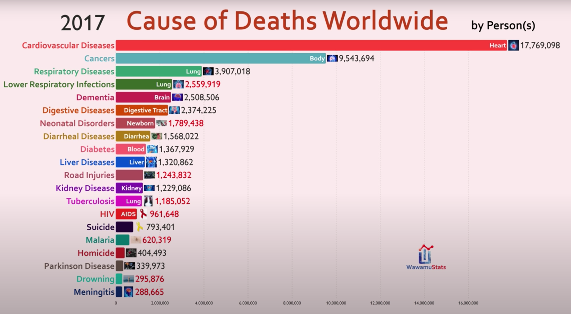
Source: Video by WawamuStats (2020), based on Global Burden of Disease (GBD) data & IHME.
For further details, Burden of Disease — Our World in Data has insightful infographics to understand the big picture of 'disease burden' worldwide — cardiovascular diseases contribute the most.
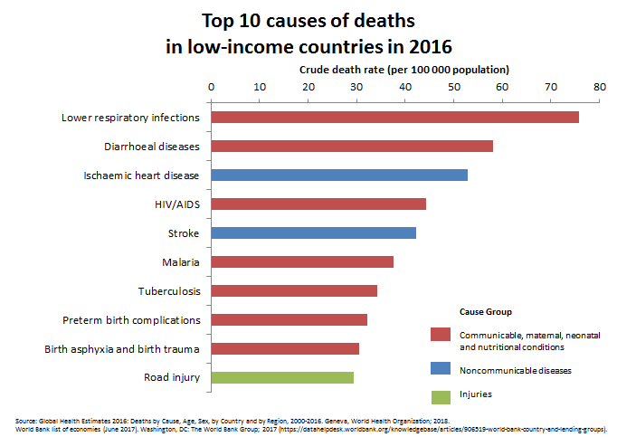
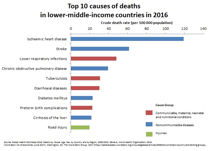
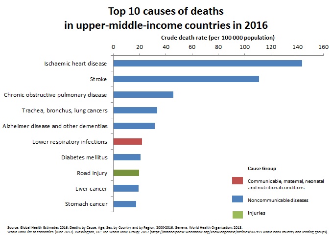
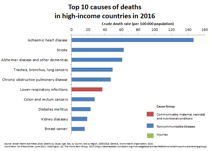
Source: All graphs below are from this WHO Article, which is based on Global Health Estimates 2016: Deaths by Cause, Age, Sex, by Country and by Region, 2000-2016. Geneva, World Health Organization; 2018.
Red vs Blue vs Green: Red bars denote Communicable, Materna, Neonatal & Nutritional Conditions. Blue bars denote Non-Communicable Diseases like heart disease, diabetes, cancers, Alzheimer's and so on. Green bars denote Injuries.
Observations:
- Death distribution changes with income: Low income countries have 7 red bars, 2 blue and 1 green. High income countries have 9 blue bars and 1 red bar. High income countries have an overabundance of deaths due to NCDs (Non-Communicable Diseases).
- IHD (Ischaemic Heart Disesae) is NCD #1: In lower-middle, upper-middle and high-income countries, the top cause for death is IHD. Only in low income countries is the top cause a red bar, yet the topmost blue bar is IHD.
Low Income Countries: Lots of red bars (7 out of 10). Topmost blue bar is IHD.
Lower Middle Income Countries: Only 4 red bars. Top bar is IHD.
Upper Middle Income Countries: Only 1 red bar. Top bar is IHD.
High Income Countries: Only 1 red bar. Top bar is IHD.
GDP & Food has some insightful graphs.

 Instagram
 YouTube